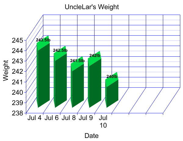
This looks a little sloppy because it’s a jpeg that that I had to reduce in size to fit within the blog boundaries. If you click on the file it will look better. I’m now going to cram it in the sidebar and see how it looks there (I suspect messy because of the distortion with reducing the jpeg).
The next step will be to convert these graphs to a vector based format so that they will resize without loosing their aesthetics.

